Redesign of Akthof
・
Redesign of Akthof ・
The goal was to transform an outdated Akthof into a modern, forward-looking art space. For this redesign, there were no creative limits – but we wanted to give the art school a strong, timeless symbol.
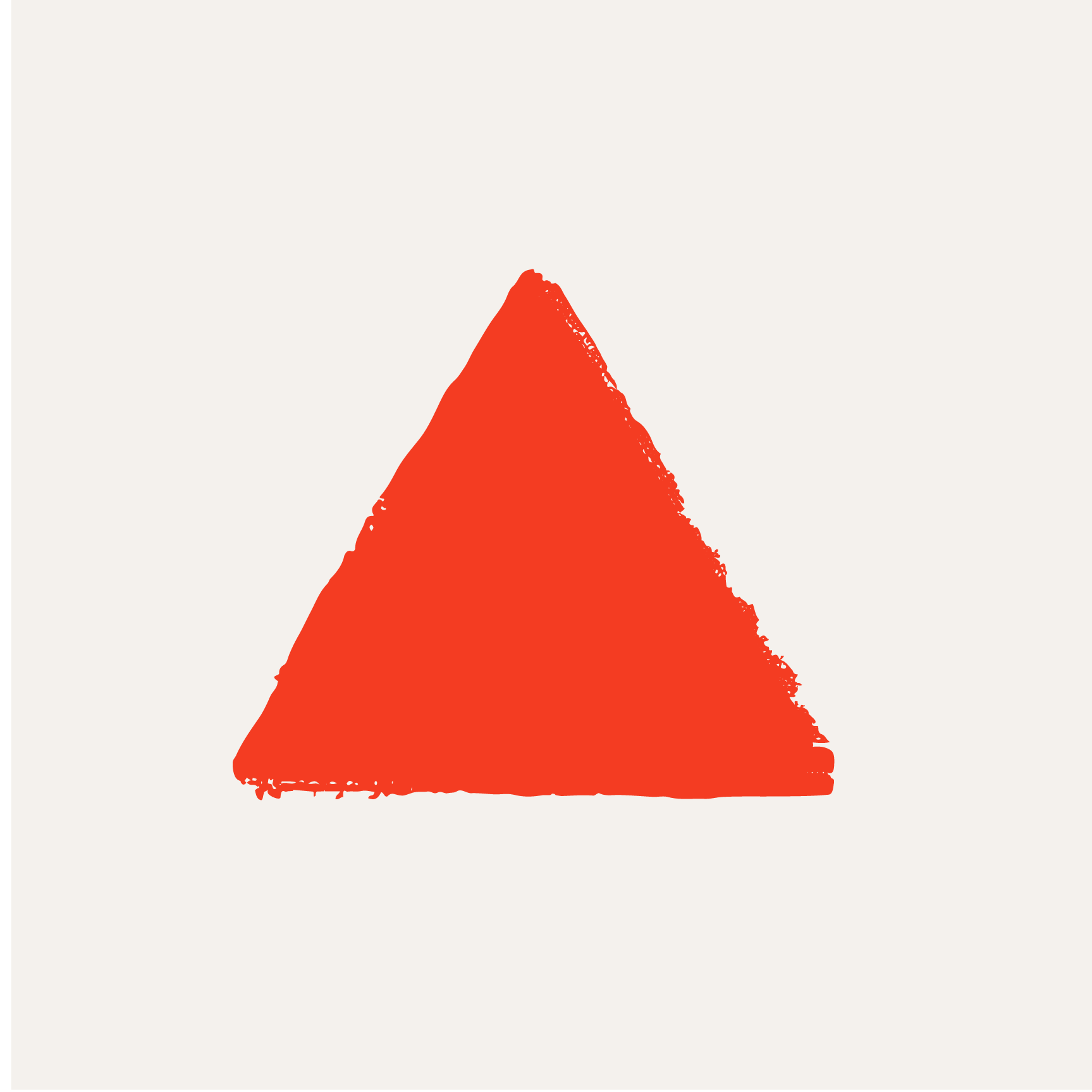
We aimed for something simple, yet deeply connected to art. That’s why we chose a triangle. This shape appears throughout the greatest artworks in history, representing one of the most fundamental principles of composition in both art and education.
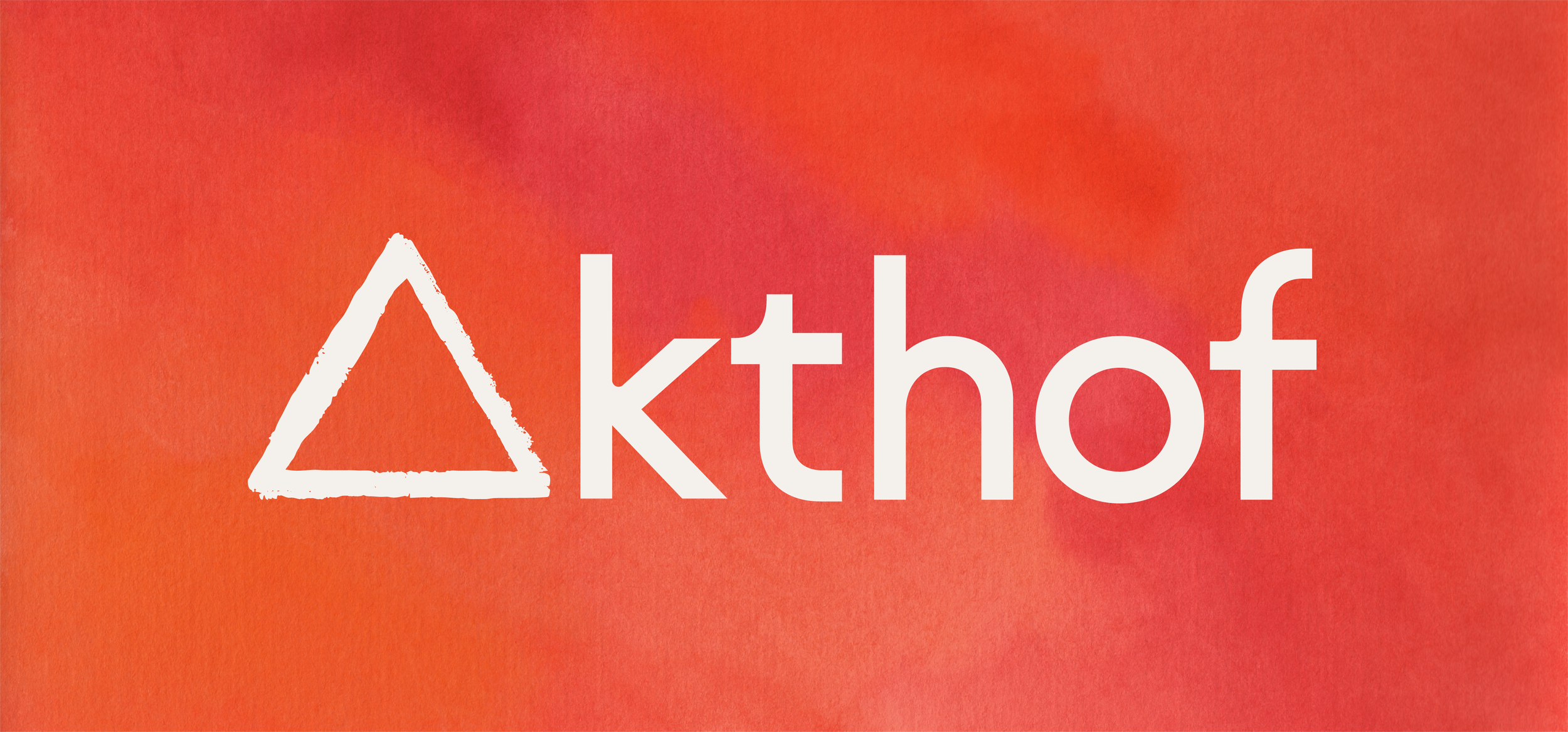
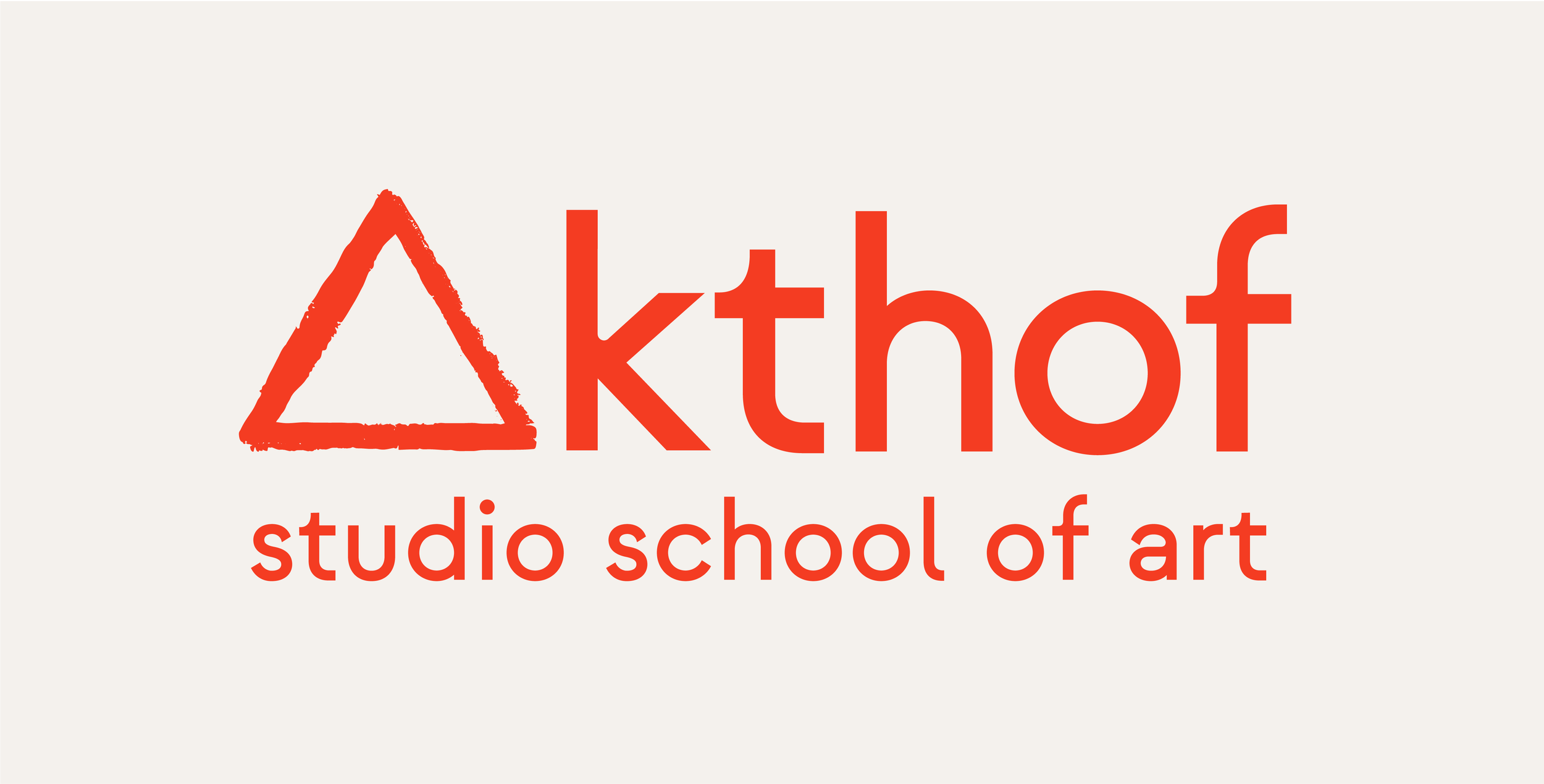
By integrating the triangle directly into the logotype, we were able to use it as the letter “A”, giving the logo a unique identity while staying minimal and meaningful.
This project was a collaborative effort with Anabel Lehmann, who later continued to implement the logo across the website, brand guidelines, and other touchpoints as a freelancer.
Partner of the Project